How I get extensive traffic from StumbleUpon!
Stumbleupon is a website where, once you are logged in you can start stumbling on random webpages. The webpages will appear according to your choice of categories. There are several categories to choose from. So this is how it works, users submit their own website or someone else’s content (only the link) to stumbleupon. There are thousands of users on stumbleupon who are stumbling on different websites. After the submission of link, it will also be one of the websites that would get stumbled upon!
Since there are thousands upon thousands of users surfing on stumbleupon every day, there is a good chance that your website will be viewed by many stumblers. If users like your content there is an option to share it on facebook or like it. The more number of likes you get, the better the chance that it will discovered and stumbled. The most “liked” content gets a top position and gets a ton of exposure, that means it will be getting thousands of views. If you have great content then it is possible that it would be shared and tweeted by a lot of stumblers. That means you get even more traffic.
It is very important to keep in mind that you website has a decent look. Certain points need to be remembered while optimizing content for stumbleupon. Just any kind of content won’t be able to fetch you those thousands of views. It needs to be optimized and should be able to attract the attention of the stumbler. I will write down certain important points that are required to do so.
Images: These are extremely powerful tools to grab someone’s attention. Lets take an example, when you grab a newspaper to read, the first thing you do is look at the images and caption. The images and the caption are the only two things that get most attention in the news paper and the second most attention drawing thing is the headlines. The same rule applies for the web pages. It is therefore, very important to add attractive images to your article.
If it is a photography website, then it is obvious that you will be having a ton of attractive, interesting images to show off. Having interesting images on your web page doesn’t suffice. They must be positioned and arranged in a way that would draw the attention on the visitor. This can be done by analyzing statistics of your webpage. Although one important area for getting a good deal of attention is to include the images at the beginning of your article. Having a small caption to the image also helps describe what your article or webpage is about.
Typography: It is the font that also plays an important role in making the content attractive. Having a neat, clean typography on your website is just as important as having a tidy house.
Research has show that sans-Seriff font family is proven to be better when it comes to reading long sentences and completing reading of content. The two best fonts in this family are Arial and Verdana.
Apart from fonts, the screen resolution also plays an important role. The sans-serif font family looks good on low resolution screens, while the Serif font (Georgia, Times new roman, etc.) look good on higher resolution screens.
It is also important to have proper line and word spacing to increase readability of your content.
Keeping the fonts simple and clean is very important, again research has shown that a it is possible that hard to read font will annoy a lot of people and they will simple stop reading anything further, while a easy to read font family is eye soothing and it indeed helps in keeping the viewer engaged in reading further. This part is very important when it comes to selling products on your website.
Sidebars: Many of our websites have a sidebar where we like to fill it with a lot of widgets, archives, comments, latest posts, etc. We stuff as much as we can into our sidebars but it is important to know what kind of impact it makes on the stumblers.
Having a cluttered sidebar with numerous widgets will only make things annoying for stumblers. My own statistics have shown that reducing the number of widgets have significantly increased readership of my blog. There has been an increase of almost 50% in the readership of stumblers that I receive everyday.
So my suggestion here would be to keep the sidebar as clean as possible.
If you have a website which has a lot of content from past and that old content has stopped being of any use to you, you can bring back exposure to them by adding links to those old posts in the sidebar.
You will also notice increased pageviews and engagement in your website when you add “Most viewed content” in your sidebar. This is something very important when it comes to social engagement.
Social Engagement evidence: People like to view content that has been viewed by many other stumblers. Now here comes the point of “social engagement evidence”.
By keeping a social sharing tools in the sidebar, it will help a lot in attracting stumbler’s attention.
Now imagine a case where you have a blog post, and it has a large number of facebook likes, retweets, and shares, it is very likely that the reader who sees this will be tempted to share your post or recommend it to his friends. Seeing the engagement evidence also increases the content readership because the stumbler will think that it has been read by so many people, it has been recommended to so many people, this definitely has to be something interesting. Exploiting this psychology is important while optimizing content for StumbleUpon.
Site load time: When you put up your content on StumbleUpon, it will be surfed by a lot of people. But if your website takes ages to load, the stumbler would simple leave your website and proceed. Now you understand that you would be loosing a large portion of potentially interested viewers just because your site does not load quickly.
Research shows that the stumblers will leave your website if it doesn’t load in under 5-6 seconds. No one likes to wait for an unresponsive and slow website.
Keeping the image size small and having an optimized CSS file will definitely help in reducing page load times. In addition to it, installing a caching plugin to your webserver will also help in reducing the amount of time spent in processing static content.
Conclusion: Designing your webpage by taking into consideration these aforementioned points will definitely increase the amount of pageviews that you get from each visitor. It would also bring you extensive traffic from StumbleUpon and there will be a very high chance that your website would get a lot of exposure.
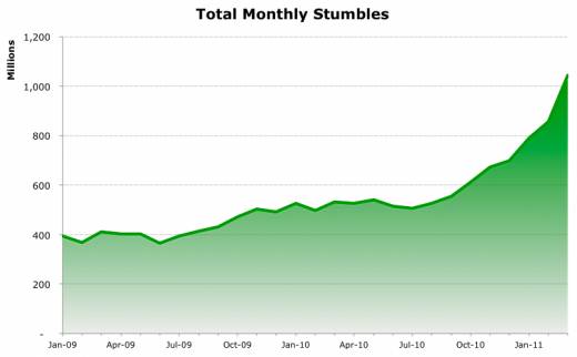
Now go ahead and make your traffic look like this……..
Don’t Forget to Like this post and share it with your friends. I am sure they would love to read this.


I have been using StumbleUpon off and on for a few years. I really haven’t gotten too much into that site, probably because there are just too many sites that I am a member of. I have read about the benefits others have experienced in the past with regards to drawing traffic using StumbleUpon, but I really haven’t devoted much time to seeing if I can repeat some of their success.
If you are getting good deal of traffic from other sources you dont need to use StumbleUpon. But I have preferred this option because I dont have many sources for traffic. SU has helped me recently in boosting up my traffic a lot! Like 40x boost in visitors and pageviews.
I should be submitting more of my awesome articles to Stumble Upon. Also, I didn’t know that the sans-Seriff font family was proven to be better for the completion of reading content. Thanks so much for writing this article, Salil!
Glad you liked my article Kevin! Yea I changed your URL that you submitted haha..
Hello Salil, I guess for me ti’s going to start back at the basics. How do I expect to get any SU traffic when I don’t even have the badges available to the readers and visitors to use. I’ve seen several people say amazing things about SU maybe ti’s time I start tapping into a bit of it.
Start submitting your URLs to SU thats, the first step. The rest is automatic. On your part, you only have to create attractive readable content.
A post beginning with a large eye catching photograph/graphic will always make the Stumbler navigate further into your website.
And, there are numerous categories on SU. So you can target a very selective audience.
Btw, nice to see you here! 😀
Great post. Have you ever tried the Paid Discovery program from Stumbleupon?
It would be great to see a review and some results from that service.
Hey David, no I have not tried SU’s paid discovery. I might consider use the service and check out the results.
Thanks for coming by and reading my article!
I especially like your point about page-load-times it is a shame when a page does not load fast. As you said, “no one likes to wait”. Thanks for the good info stumble upon. I need to try it again. It has been a long time since I used it.
I guess you might have noticed a little bit of page load time issue on my blog as well.. haha
I cannot stress enough how important page speed optimization is. After page speed optimizing my page and those of my clients I saw major increases in my organic traffic stats.
Page speed optimization is just never enough!
thanks for the information, l will try it out coz l almost have no traffic 🙂
That is great. this is one of the methods that works.