Windows 8 Release Preview | Hands on Review
Windows 8 Release preview was released to the public today. To the people living in caves, windows 8 is the new operating system being developed by microsoft, which is meant to be installed on touch enabled systems, especially tablet PCs. Windows 8 is aimed at the tablet market as you will see later why!
Noticable differences in Windows 8 Consumer Preview (Beta):
- No start button
- A vivid metro user interface as a welcome screen
- Improved clarity and typography
- Integrated PDF reader
- Windows Titles are center aligned and the window corners are sharp
- Aero interface is modified and it appears like a blend of older UI with the newer Aero interface.
- A new informative and detailed task manager
- Ribbon interface on windows explorer, just like office 2010.
- Not to mention the new logon screen
- Skydrive integration for cloud storage
Changes in Windows 8 release preview:
- Colours are more solid and less glossy
- You can personalise the colour scheme at the time of installation
- The logon screen is changed yet again to a simple “Windows” with no animation
- Visual changes and major bug fixes
Windows 8 release preview crashes much less! The major problem I faced with the Windows 8 Consumer preview was that the touchpad of the laptop would become non responsive and would require a hard tap for a click to be registered. This bug is fixed in windows 8 release preview.
Apart from that, another noticable change was the option to change the windows UI colour scheme at the time of installation. There are vivid colour you can choose from and set them as your windows UI colour scheme.
The other change I could notice was change in the colours. The colours, progress bar colours are now less shiny and have solid colour with little gradient. Microsoft seems to have moved away from the Aero interface and have blend the older windows 2000 and Windows 7 interface together to give us some new look. This can be seen by looking at the window corners which are sharp as they were in very earlier versions of windows, and then look at the colour, it is more like the Aero glass.
You can Download the Windows 8 Release Preview from here: http://windows.microsoft.com/en-US/windows-8/iso
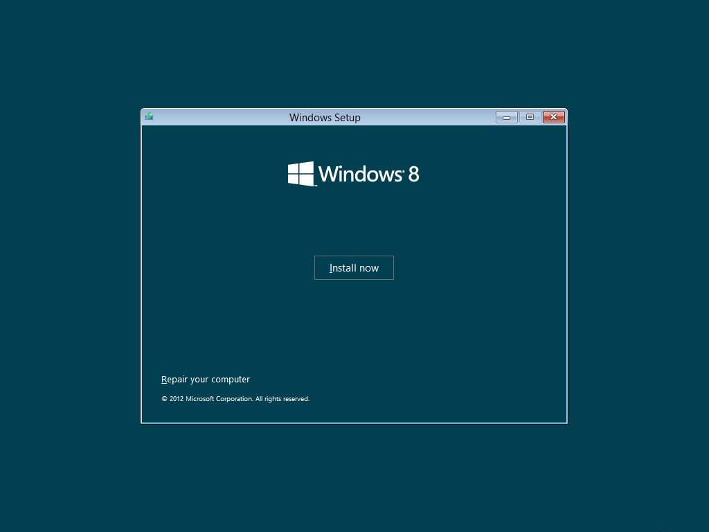
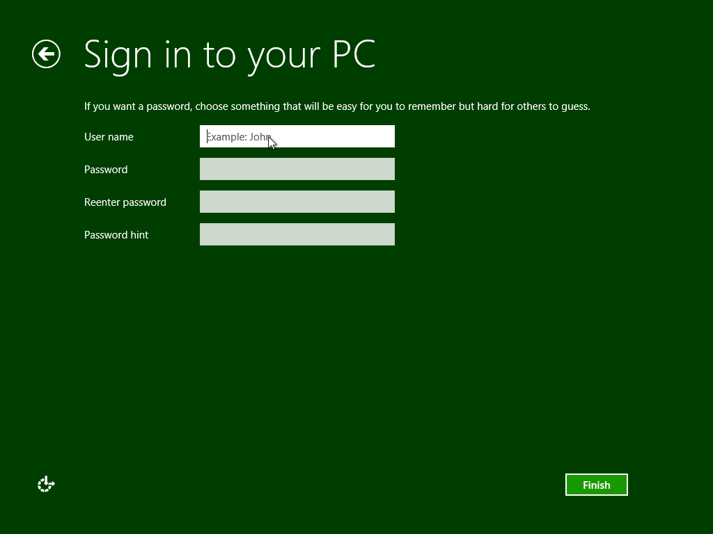
Lets get into the Windows 8 Release Preview installation:
Thats all about Windows 8 Release preview. I will be testing Windows 8 Release preview on my home laptop and see how it performs under normal operations. My normal operations are 10 tabs of firefox, windows media player, sony vegas pro running/rendering, yahoo messenger, skype and teamviewer running at once. So, hopefully Windows 8 RELEASE PREVIEW will be able to cope with this. Another noticable improvement in Windows 8 Consumer preview was extremely fast startup and shutdown times, and also improved battery life.
Like and share this post if you find it useful.


I’ve been meaning to get this off of the MSDN to try and load it on my lil’ netbook.
You will have to let me know if this is good enough as a “daily driver” or if it still needs work.
I don’t like the lack of a start button or the “Metro” tiles. I understand that MS wants to integrate it’s look into all of its products – but the tiles are the wrong way to go!
Hey Jason, Windows 8 Release preview is really improved over the previous beta version. If you like to have a changer over, and if you can adapt to changes pretty well, then this is definitely for you. The new graphical changes are eye soothing.
It surely is a good one for daily use. Although the tiles are not as bad, you get used to it pretty quick, atleast I did.
And, the addition of inbuilt adobe flash player and adobe pdf reader saves a lot of time on installing the adobe softwares.